POS (Point of Sale) System //
POS Cakra is a point-of-sale web app built for PT. Cakra Radha Mustika — covering transactions, inventory, and financial reporting in one place. It shipped and runs daily at the office cooperative and at the Philippines branch.
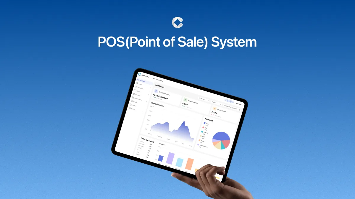
POS Cakra is a point-of-sale web app built for PT. Cakra Radha Mustika, covering transactions, inventory, and financial reporting in one place.
I designed it with one other designer. We split the modules between us and reviewed each other's work as we went, with the same scope on both sides: research, visual design, and interaction design. It shipped and runs daily at the office cooperative and at the Philippines branch.
Retail store operators at PT. Cakra Radha Mustika were managing stock and transactions manually — which meant missing records, inaccurate monthly reports, and no reliable way to track what was actually happening in the store. Three things were causing the most friction:
- Stock & Inventory — overstocking was common, caused by ineffective purchasing strategies and the lack of an integrated inventory system.
- Journal Transaction — manual or irregular record-keeping led to missing or undocumented transactions, making monthly financial reports unreliable.
- Device — existing digital solutions demanded high-spec hardware and came with service fees too costly for many business owners.
We interviewed the Head of Store at KALCare to understand what running one of the company's outlets actually looks like day to day. Two things came up more than once: stock was hard to manage across rejected items, expiration dates, and variants, and transaction journals were too tangled to show whether the store was making money. What he wanted was not complicated — reliable inventory reporting, a clear read on income against expenses, and customer data he could actually use.
We also looked at three POS products already on the market: Majoo, Moka, and Kasmini. The same gaps showed up in all of them — inventory management that stopped short of what the business needed, pricing on the high side, and storage that wasn't great. One interview is a thin base for a system this size; the benchmark covered part of it, and we treated the rest as a hypothesis to correct once the design was in front of real operators.
Based on the research and benchmark findings, we narrowed the scope to four feature areas: inventory management, transaction recording, financial reporting, and customer data. These became the backbone of the information architecture before any design work started.
We worked through key user flows and page structures first — mapping out how operators would move through the system before committing to visual decisions. Getting this right early kept the high-fidelity work focused.
The product would be used daily by store staff, so the interface needed to be fast to navigate and easy to read at a glance. We kept the layout clean and the hierarchy clear, prioritizing task speed over visual complexity.
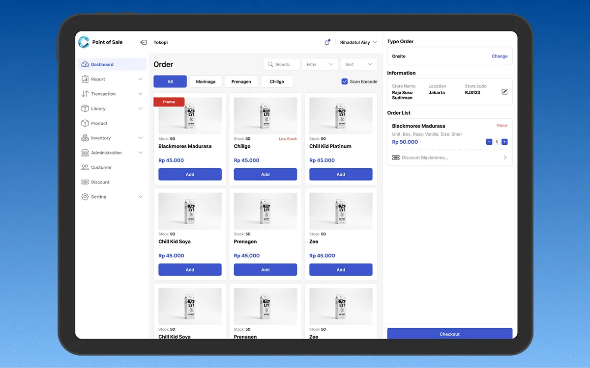
Most of the revision went into the Order screen. The first pass put too much product information on the page at once, which fought against the one thing that screen exists to do. We cut it back over a few rounds, working out what a cashier needs while a customer is standing there and what can wait behind a tap.
Final designs were documented and organized in Figma by module, structured for clean developer implementation.
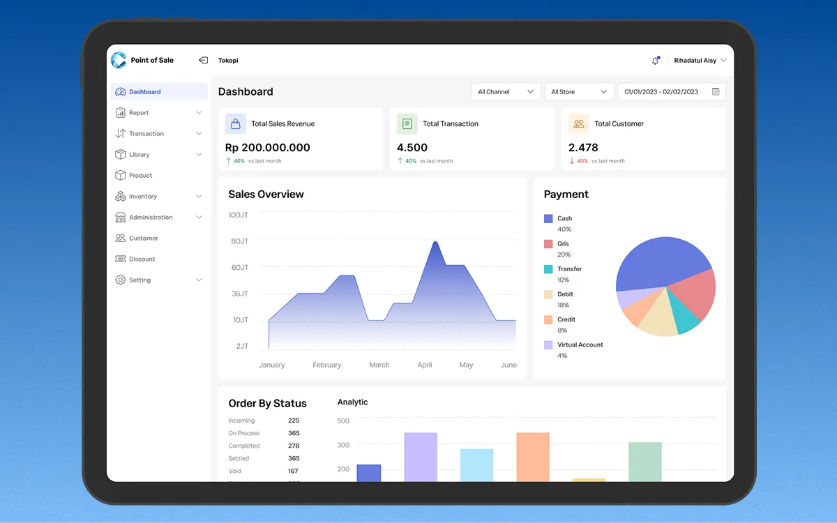
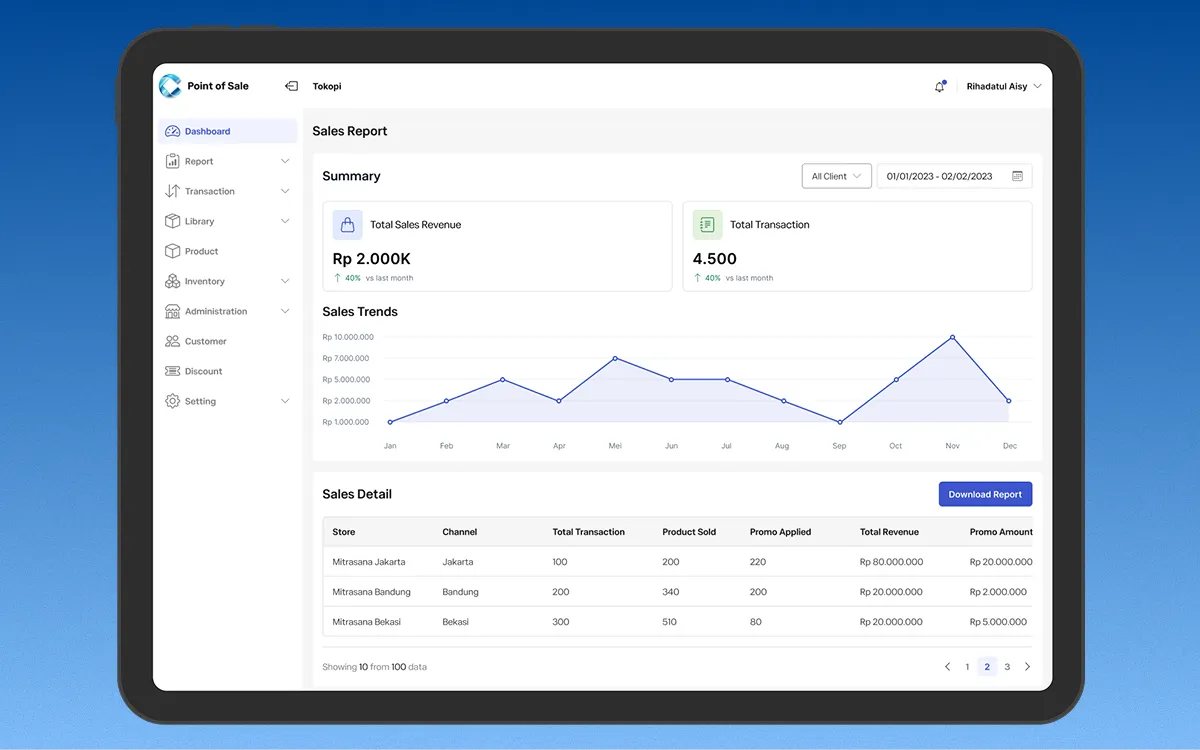
Dashboard — total revenue, orders, customers, and discounts at a glance, plus sales trends and a payment method breakdown. The real decision here was what to leave off: operators want a fast read on how the store is doing, not every number the system holds, so the summary stays at product data, customer data, income, and expenses. Everything else sits one level down.
Order System — the main transaction screen, built for speed. Cashiers browse by category, see live stock, build an order, and check out. This one took the most revision: the first version showed too much product detail at once and slowed down the exact task it was meant to speed up. We stripped the density back and moved secondary detail behind interaction, keeping only what a cashier needs mid-transaction on the screen.
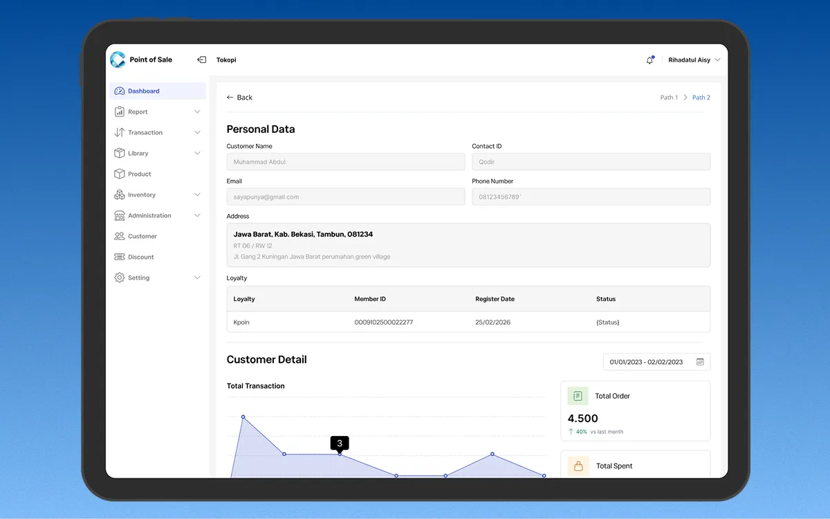
Customer Data — purchase history, most-ordered items, visit patterns, and contact details per customer. Operators get a view of individual behavior without running a separate CRM.
Inventory Management — stock monitoring covering product variants, expiration dates, and rejected items: the three things the store operator raised first in the interview.
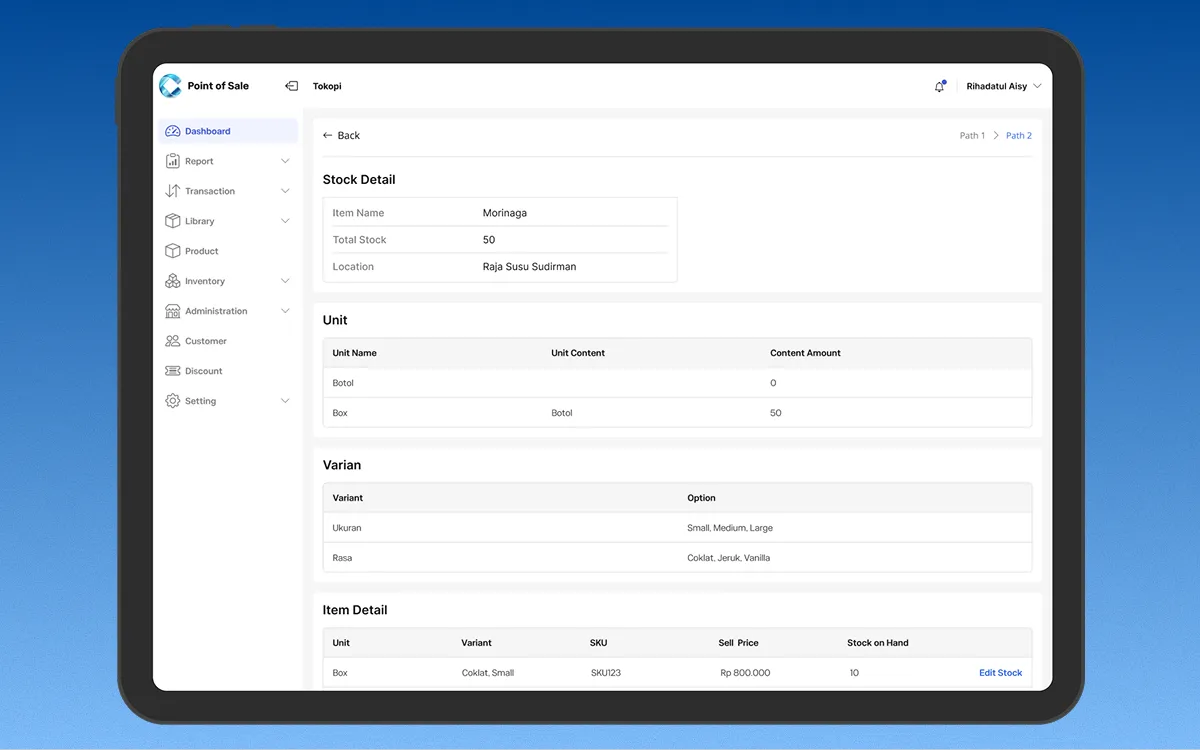
Web-Based & Lightweight — runs in a browser on whatever machine the store already has. No POS terminal, no hardware spend, which was the cost problem operators kept hitting with the alternatives.
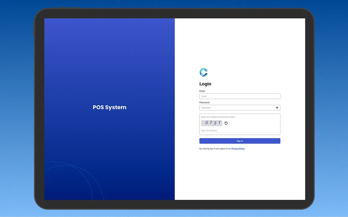
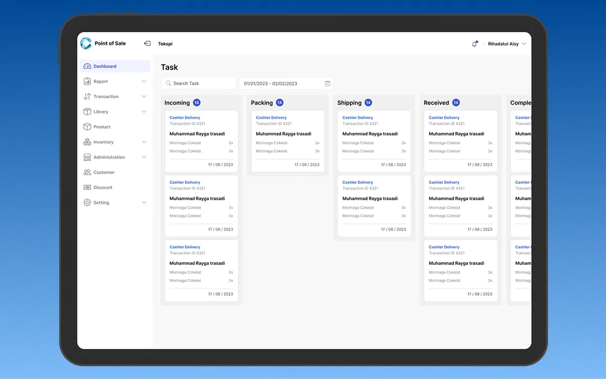
Beyond the core flows, the system also covers Task, Sales Report, Account, Detail Transaction, Settlement, and Checkout screens.
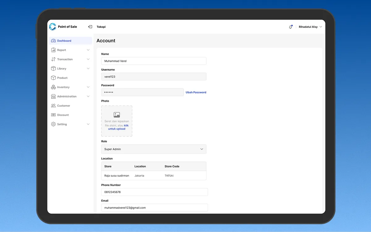
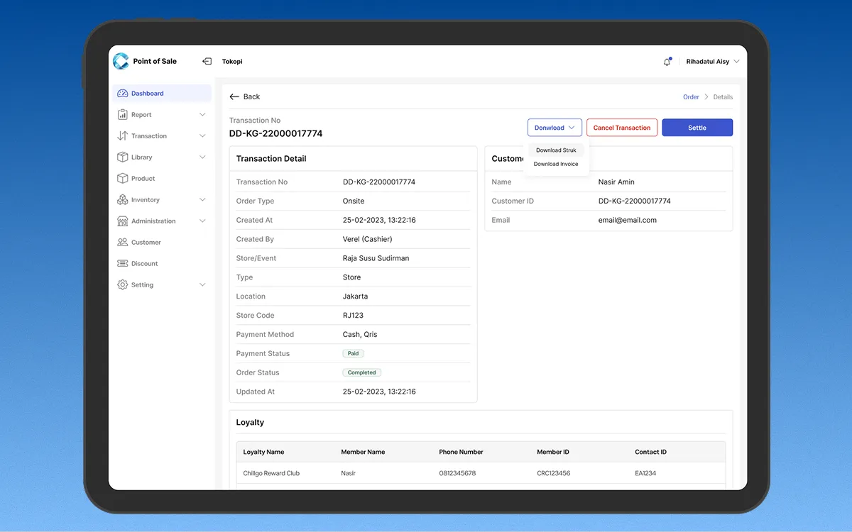
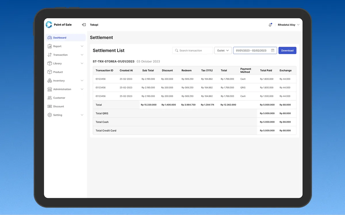
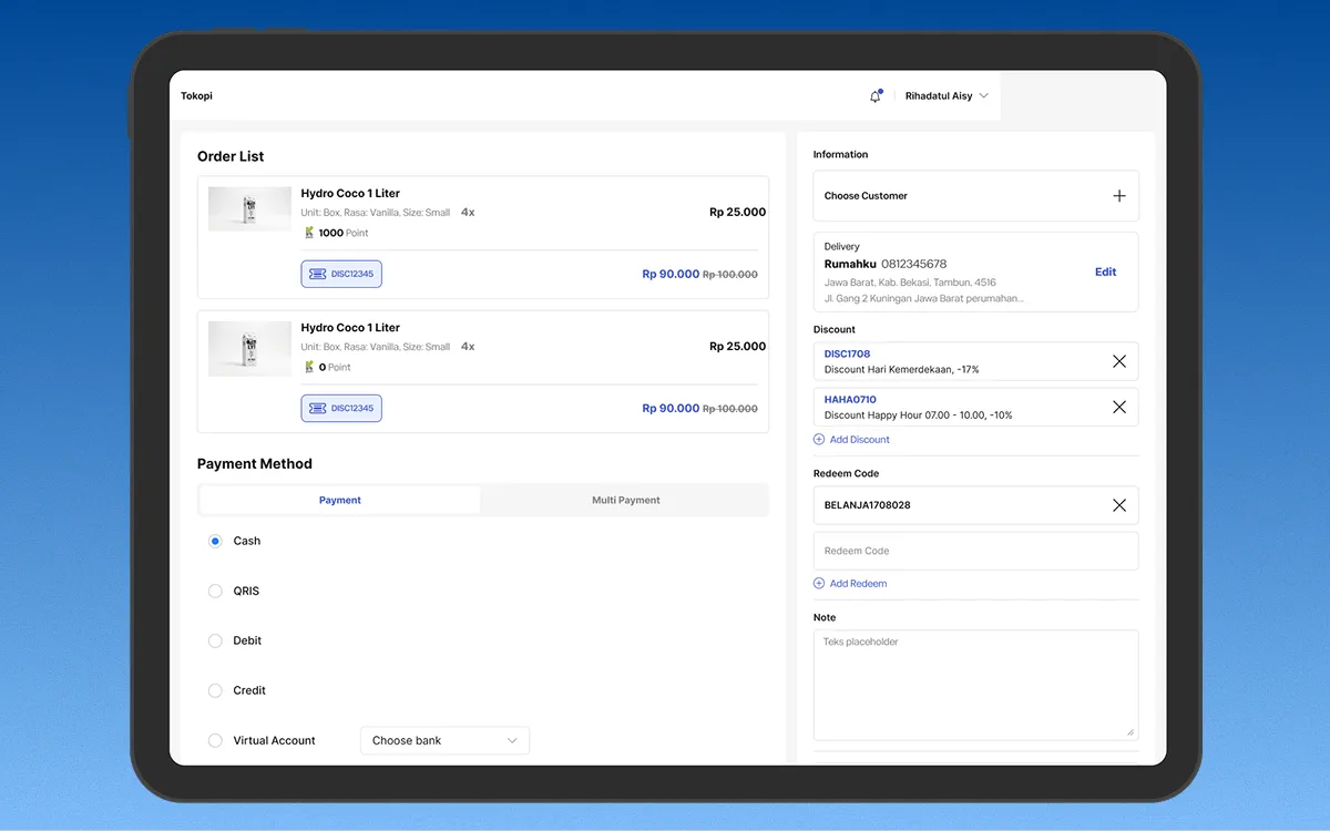
This was the first POS project I'd worked on. What surprised me was how much the domain drove the design. Once you follow a transaction into a journal, into a report, back into an inventory decision, you stop drawing screens and start drawing a system. The UI was its own problem: a POS holds a lot of data across a lot of modules, and the hard part was showing it without burying the person using it. The Order screen took several rounds before it got there.
It shipped, and people use it every day. The office cooperative runs over 100 transactions a day on it, and the Philippines branch picked up the same build, which we hadn't designed for.
A few numbers the team tracked. It rolled out to 10+ Kalbe partner stores and onboarded 1,000+ active customers. Over 2025 it brought in about IDR 1.5 billion and raised total revenue across partner stores by 20%. Transaction data feeding the CRM enriched 300,000+ customer profiles with real-time history. A loyalty event built into the in-store flow drove 1,000+ new sign-ups. And the inventory redesign cut manual input errors by 40%, a before-and-after the PM measured.
What I don't have is the follow-up on the design itself. No instrumentation, no post-launch interviews. I can't tell you whether reporting got more reliable or whether it saved anyone time. People say it's going well and I believe them, but I didn't measure it, so I won't put a number on that. Next time I'd settle the success metric before drawing the first screen.
View on Behance